

Inflow is a responsive web app, that allows users to track their periods and symptoms throughout the menstrual cycle and get customized information and self-care guidance.
Inflow is my Career Foundry UX Design Immersion Course project.
My Role: Research, UX/UI Design
Tools: Pen & Paper, Adobe XD/Illustrator/Photoshop, Google Forms, Optimal Workshop, Usability hub, zoom
The objective was to design a health/wellbeing app that allows health-conscious individuals to record their health and medical information, as well as access general physical and mental wellbeing features. I decided to create a menstrual health app because the menstrual cycle and its impact on people’s everyday lives is still an often underestimated topic.
Working title: “Olive”.

Menstruating people need a way to track their period and symptoms to learn what is happening with their body and how to support their body and mind to create better harmony with their cycle.
We will know this to be true when we see users regularly using the app, tracking their symptoms, and consuming educational content.
I researched competitors to compare their strengths and weaknesses to my Idea and find out what opportunities I could take with my product. I did competitive analyses of two of the most popular menstrual health apps, Clue and Flo.

Key objectives
· Flo is one of the most popular period tracking apps
· It allows users to track their period and a variety of symptoms to predict their cycle
· Focuses exclusively on women.
Overall strategy
· Flo seems to rely on its high number of users
· The website doesn’t offer any additional content
Market advantage
· Misleading communication about privacy has damaged the reputation
· But it’s still among the top period tracking apps
Marketing profile
· Flo has raised a total of $25.5M in funding
· Flo has stuck to its original mission
· But the app has lost users’ trust because of leaking data


Key objectives
· Clue is one of the most used period apps
· Users can track their period and a variety of symptoms and the app uses that information to predict the next period as well as fertile days
· Users get a lot of additional information
Overall Strategy
· Social Media seems to be the main marketing channel
· Clue offers a great variety of content
· Big focus on inclusivity
Market advantage
· High positions in Google searches and App/Play Store searches
· Great ratings
Marketing profile
· Clue has raised a total of $29.7M in funding over 7 rounds
· They’ve stuck to their mission
· Clue keeps the promise of being “more than a period calendar”

I also did a UX Analysis of the most important competitor Clue.
Usability
· Clue’s overall experience is easy and pleasant, and it’s ad-free. Although the app is very clearly structured, there is a lot of swiping necessary when tracking various symptoms.
Layout
· The design is quite simple and clean but still has little playful details and it is not at all girlie. All the Icons are easy to understand and the navigation is very clear. Especially the graphic that shows the menstrual cycle as a circle on which users can slide through different dates/phases is a cool feature.
Navigation structure
· The navigation bar is very clean and simple and the Icons are easy to understand. The most important feature “Track” is right in the middle for intuitive access to the app’s main function.
Compatibility
· Clue is available for iPhone, Apple Watch, and Android.
Differentiation
· Clue allows its users to track a big variety of symptoms.
· It is not pink and girlie like many competitors and doesn’t address only women.
· It has an Encyclopedia.
· It offers educational content written by their science team in 3 languages, but only for premium users.
· I think it would be even better to offer the additional content in small portions (along with tips for the users’ everyday life) according to the users’ current cycle phase, symptoms, and predictions.
CTA's
· Signing up and staying logged in was no problem at all.
· Users can use the app without being disturbed by any pop-ups. There is only a little banner that invites them to test the premium version.

From a user survey and user interviews, I learned, what potential users expect from a menstrual health app and that they want to have more information about self-care concerning their menstrual cycle.
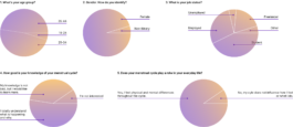
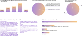
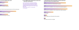
Building upon the survey results, I interviewed three people about their experiences with menstrual health apps and the impact their menstrual cycle has on their lives.
I summarized my findings from the survey and the interview in an affinity map.
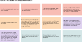
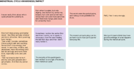
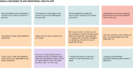
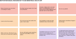
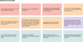
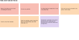
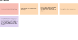
· Participants are aware of the effects their menstrual cycle has on their physical and mental well-being
· Most participants use period tracking apps
· The most important features are an overview of period dates and the possibility to track different symptoms
· Participants are open to trustworthy self-care information
· Staying motivated is a challenge

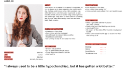
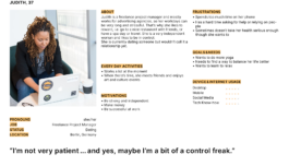
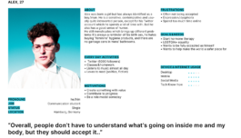
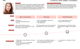
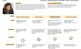
The information I gathered in my research formed the basis for 3 user personas, that I focused on during the designing process.



I started sketching some wireframes and upgraded them to mid- and high-fidelity wireframes...

... and finally, a mid-fidelity prototype to test with potential users.

I conducted 6 usability tests, which have given me very valuable insights, especially regarding possible misunderstandings.
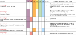
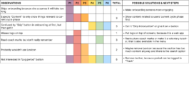
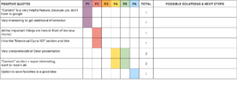
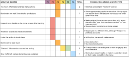
I summarized and categorized my findings in an affinity map and a rainbow spreadsheet, focusing on errors.

· The amount of information needs to be reduced and the structure needs to be simplified
· Coach marks design needs to be more obvious so users know it's an introduction to the app
· Today's Insights section should be more prominent
· Homescreen icon/title needs to be clearer


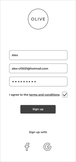


(Result in final Prototype ...)

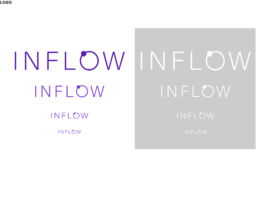
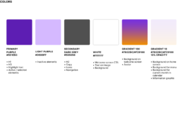
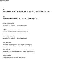
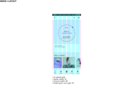
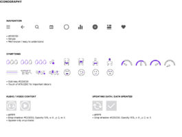
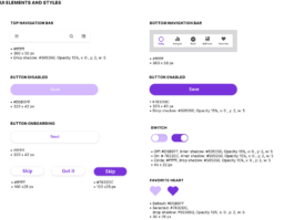
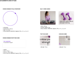
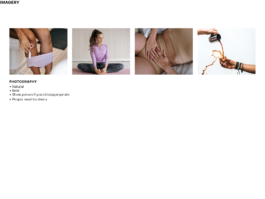
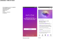
With the basic structure and functionality being established, I focused on the visual design of the app and created a style guide to specify colors, typography, imagery, iconography, and UI elements and styles.

↑ Back to top
Inflow is a responsive web app, that allows users to track their periods and symptoms throughout the menstrual cycle and get customized information and self-care guidance.
Inflow is my Career Foundry UX Design Immersion Course project.
My Role: Research, UX/UI Design
Tools: Pen & Paper, Adobe XD/Illustrator/Photoshop, Google Forms, Optimal Workshop, Usability hub, zoom
The objective was to design a health/wellbeing app that allows health-conscious individuals to record their health and medical information, as well as access general physical and mental wellbeing features. I decided to create a menstrual health app because the menstrual cycle and its impact on people’s everyday lives is still an often underestimated topic.
Working title: “Olive”.

Menstruating people need a way to track their period and symptoms to learn what is happening with their body and how to support their body and mind to create better harmony with their cycle.
We will know this to be true when we see users regularly using the app, tracking their symptoms, and consuming educational content.
I researched competitors to compare their strengths and weaknesses to my Idea and find out what opportunities I could take with my product. I did competitive analyses of two of the most popular menstrual health apps, Clue and Flo.

Key objectives
· Clue is one of the most used period apps
· Users can track their period and a variety of symptoms and the app uses that information to predict the next period as well as fertile days
· Users get a lot of additional information
Overall Strategy
· Social Media seems to be the main marketing channel
· Clue offers a great variety of content
· Big focus on inclusivity
Market advantage
· High positions in Google searches and App/Play Store searches
· Great ratings
Marketing profile
· Clue has raised a total of $29.7M in funding over 7 rounds
· They’ve stuck to their mission
· Clue keeps the promise of being “more than a period calendar”


Key objectives
· Flo is one of the most popular period tracking apps
· It allows users to track their period and a variety of symptoms to predict their cycle
· Focuses exclusively on women.
Overall strategy
· Flo seems to rely on its high number of users
· The website doesn’t offer any additional content
Market advantage
· Misleading communication about privacy has damaged the reputation
· But it’s still among the top period tracking apps
Marketing profile
· Flo has raised a total of $25.5M in funding
· Flo has stuck to its original mission
· But the app has lost users’ trust because of leaking data

I also did a UX Analysis of the most important competitor Clue.
Usability
· Clue’s overall experience is easy and pleasant, and it’s ad-free. Although the app is very clearly structured, there is a lot of swiping necessary when tracking various symptoms.
Layout
· The design is quite simple and clean but still has little playful details and it is not at all girlie. All the Icons are easy to understand and the navigation is very clear. Especially the graphic that shows the menstrual cycle as a circle on which users can slide through different dates/phases is a cool feature.
Navigation structure
· The navigation bar is very clean and simple and the Icons are easy to understand. The most important feature “Track” is right in the middle for intuitive access to the app’s main function.
Compatibility
· Clue is available for iPhone, Apple Watch, and Android.
Differentiation
· Clue allows its users to track a big variety of symptoms.
· It is not pink and girlie like many competitors and doesn’t address only women.
· It has an Encyclopedia.
· It offers educational content written by their science team in 3 languages, but only for premium users.
· I think it would be even better to offer the additional content in small portions (along with tips for the users’ everyday life) according to the users’ current cycle phase, symptoms, and predictions.
CTA's
· Signing up and staying logged in was no problem at all.
· Users can use the app without being disturbed by any pop-ups. There is only a little banner that invites them to test the premium version.

From a user survey and user interviews, I learned, what potential users expect from a menstrual health app and that they want to have more information about self-care concerning their menstrual cycle.


Building upon the survey results, I interviewed three people about their experiences with menstrual health apps and the impact their menstrual cycle has on their lives.
I summarized my findings from the survey and the interview in an affinity map.


· Participants are aware of the effects their menstrual cycle has on their physical and mental well-being
· Most participants use period tracking apps
· The most important features are an overview of period dates and the possibility to track different symptoms
· Participants are open to trustworthy self-care information
· Staying motivated is a challenge

The information I gathered in my research formed the basis for 3 user personas, that I focused on during the designing process.


I started sketching some wireframes and upgraded them to mid- and high-fidelity wireframes...

... and finally, a mid-fidelity prototype to test with potential users.

I conducted 6 usability tests, which have given me very valuable insights, especially regarding possible misunderstandings.
I summarized and categorized my findings in an affinity map and a rainbow spreadsheet, focusing on errors.


· The amount of information needs to be reduced and the structure needs to be simplified
· Coach marks design needs to be more obvious so users know it's an introduction to the app
· Today's Insights section should be more prominent
· Homescreen icon/title needs to be clearer


(Result in final Prototype ...)

With the basic structure and functionality being established, I focused on the visual design of the app and created a style guide to specify colors, typography, imagery, iconography, and UI elements and styles.


↑ Back to top